Vinyl Revive
Made for Class.
VinylRevive Co. is the ultimate hub for vinyl enthusiasts. They offer premium, eco-friendly turntables that perfectly capture the essence of that classic vinyl sound with a modern, sleak, minimalist twist. The company’s main selling point is its extensive turntable repair kits and manuals. VinylRevive Co. caters to a specific and passionate target audience, consisting of adults aged 25 to 55, both male and female, with a middle to high income. These customers are avid vinyl enthusiasts and audiophiles who deeply appreciate the classic sound of vinyl.
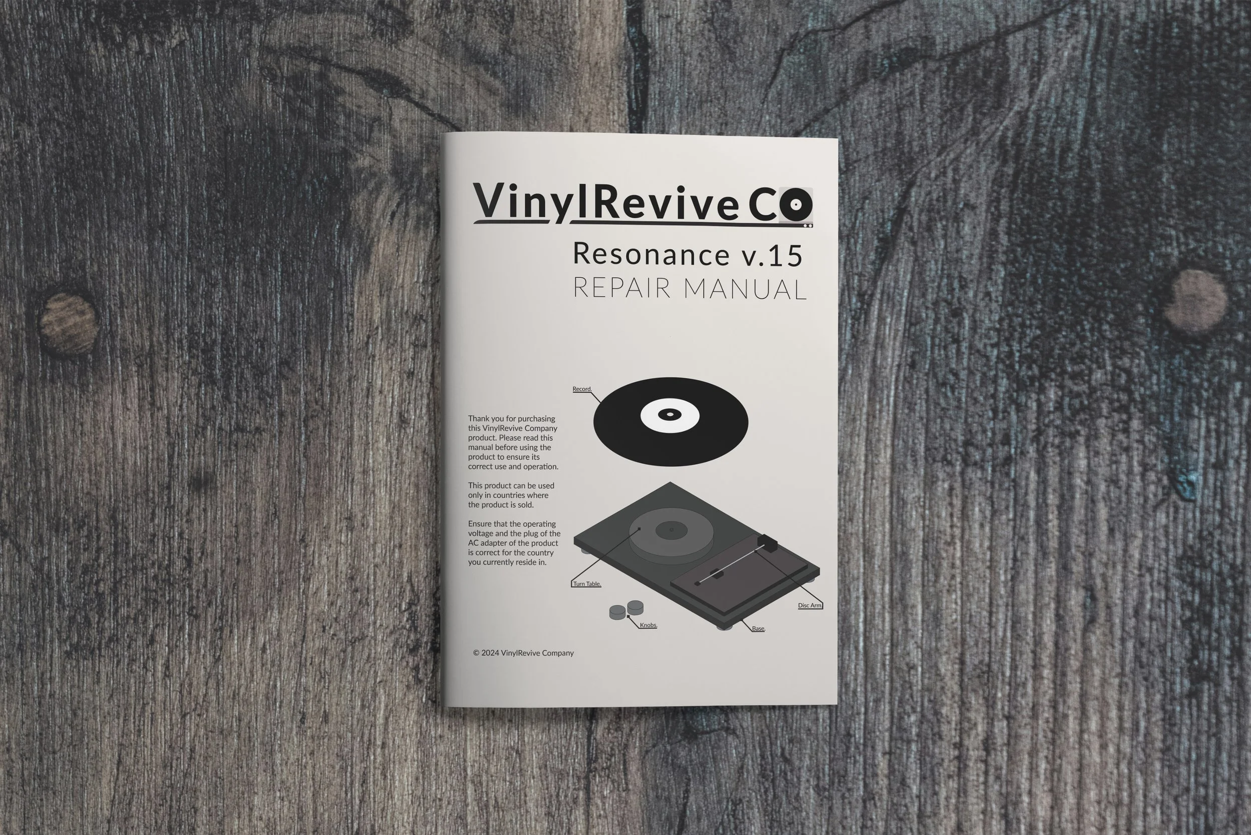
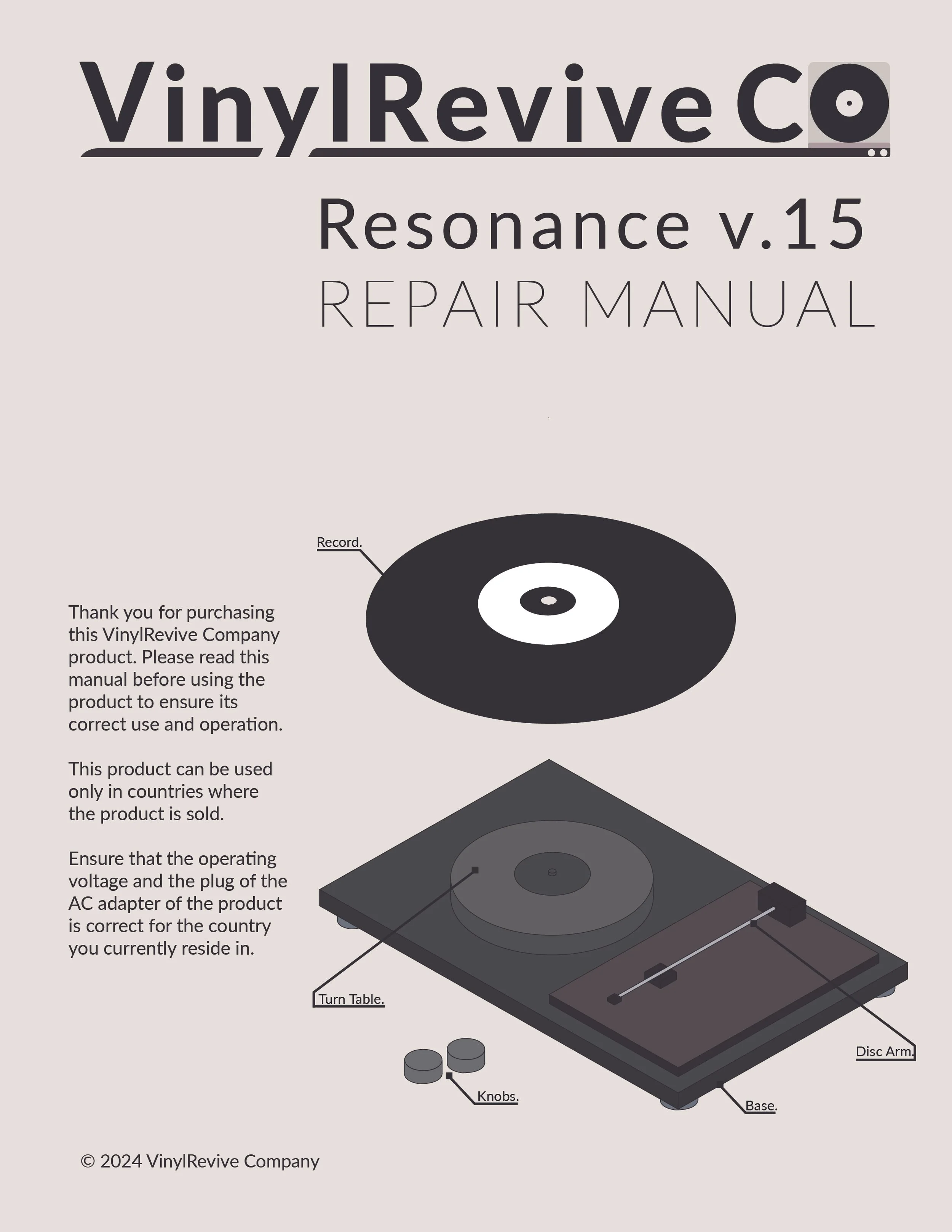
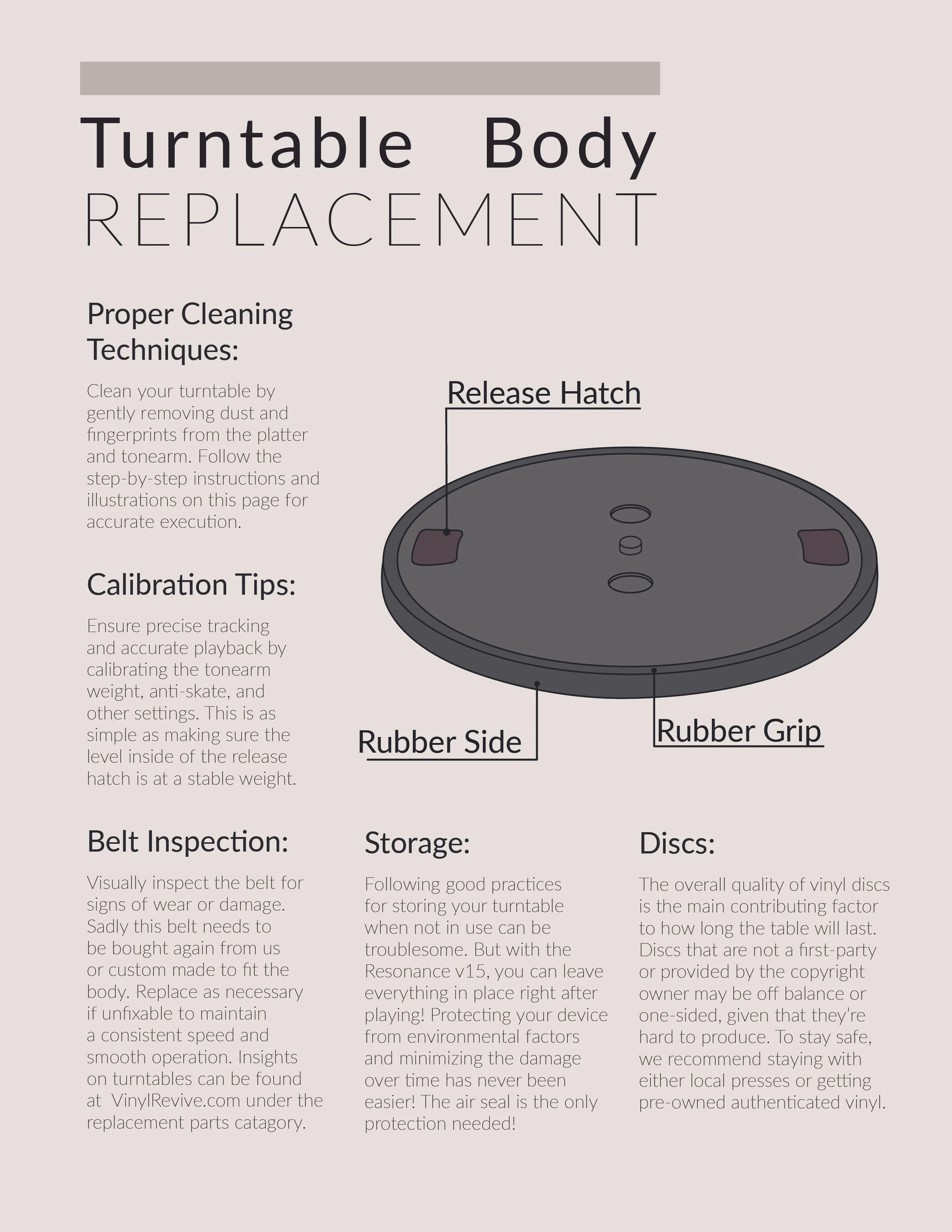
This campaign emphasizes page formatting and places technical illustration as the focal po. In response to the client’s, VinylRevive, request, the focus was on providing clear and digestible visuals showcasing their products. The goal was to simplify the appearance for individuals seeking a straightforward guide on product features. The solution involved the creation of boldly outlined, user-friendly illustrations accessible to anyone.
Isometric Stylized Illustrations
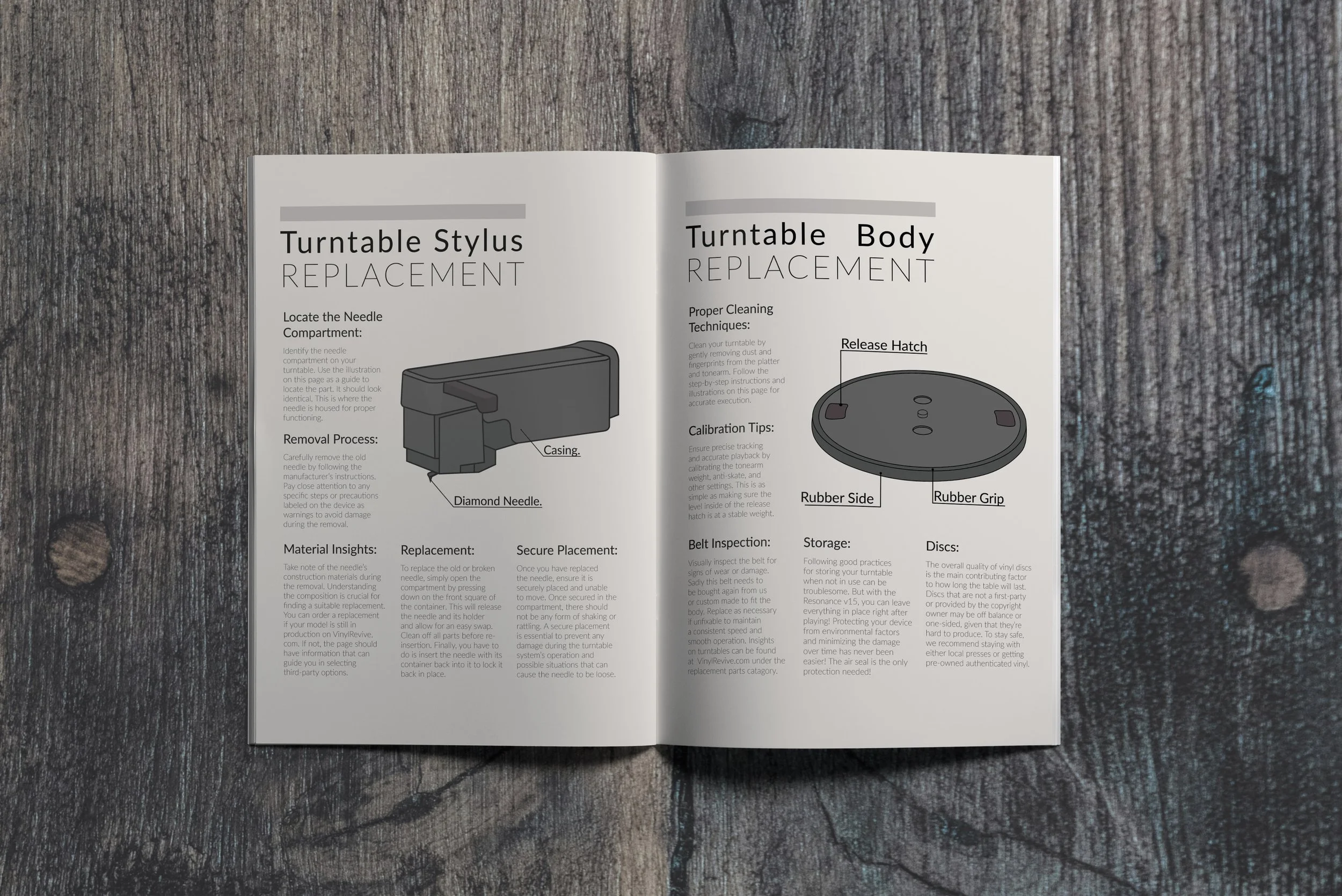
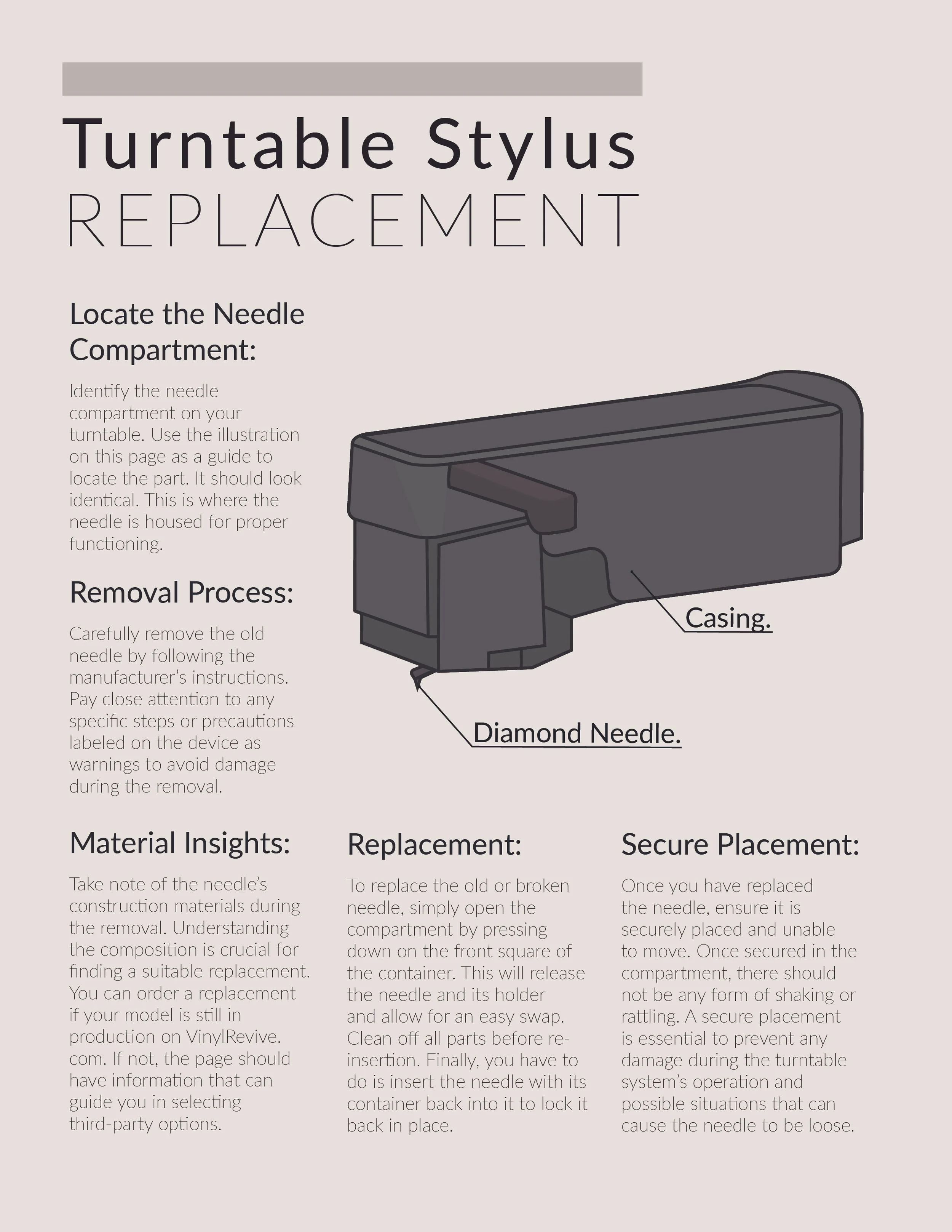
This campaign showcases isometric stylized illustrations prominently, making their perfection a primary focus. The significance of isometric mechanical illustration is often overlooked until its necessity arises, which inspired the ideas behind this campaign.
The color choices were a personal choice of mine. I love the warm darker colors and wish they were used more in manuals and daily objects. The warmth really lets the reader feel at home and relaxed reading the manual, letting them take in the information even better.
Layout
In addition to showcasing illustrations, this campaign features a distinct layout that brings much-needed organization to the page. The presence of layout enhances the significance of isometric mechanical illustration.
The copy was crafted to communicate the contents of a comprehensive manual, albeit not a direct replica of one. Consequently, creating the copy proved challenging and consumed the most time throughout the project. Integrating text to convey the design produced a unique feel unlike anything I've created before, and I eagerly anticipate the opportunity to work on similar projects in the future.
Font
Selecting the right font posed a challenge in achieving the desired aesthetic for this multi-page document. After careful consideration, I settled on Filson Pro, as it effectively combines a natural typographic feel with a futuristic quality akin to fonts commonly found in manuals.
Despite the challenges encountered throughout this project, the end result is a visually appealing and cohesive showcase of my skills, which aligns perfectly with my intended objectives.


