

Net Zero Habits
Made for Class & Case Study.

Net Zero Habits is an eco-friendly app for young people who want to reduce their carbon footprint and live sustainably. The app provides a platform for promoting sustainable habits while prioritizing personal growth without compromising on convenience.
The project started and ended within the bounds of Fall semester 2023.


The Problem.
Most young people are too caught up in daily life and don’t have time to plan beneficial, healthy habits for the world and themselves
My Role.
I am Keir Johnson, the creator, designer, logo designer, UX designer, and UI designer for Net Zero Habits.
The Goal.
Create an app that positively influences younger people to create positive habits and better themselves and their environment in a convenient, easy-to-track way that puts less pressure on the user.
Responsibilities.
Given my role, I created everything from the ground up for Net Zero Habits. My main focus was on a user-centered design approach. The process involved conducting extensive user research, logo design, developing all formats of wireframes, and creating/finalizing high-fidelity prototypes, along with working directly with user testing.

User Pathing
In the start of the initial planning phase, I spent a great deal of time making a user path framework that would work for my target audience. Given that the audience is often caught up in their busy lives, focusing on making the app small yet usable was the first step in the long process of making the app.

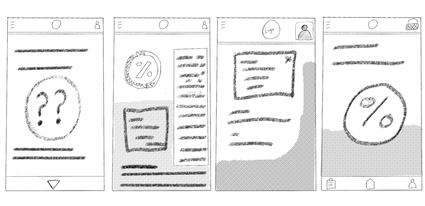
Paper Wireframes
While working on the paper wireframes, the ideas I had in mind didn't quite align with a typical app format. I attempted to integrate some standard browser-based concepts, but unfortunately, they didn't seem to harmonize well. Ultimately, the final result was quite distant from the envisioned wireframe designs. But the original goal of having the app be small and usable remained true, even in these first stages.
Digital Wireframes
My primary objective with the wireframes was to establish a robust layout—a departure from the common practice where many designers swiftly proceed to testing at this stage. My emphasis was on honing the desired layout, refining it meticulously to elicit early feedback. This approach aimed to facilitate extensive feedback loops, enabling swift adaptations within my design.
By prioritizing the layout's refinement to an early lo-fi prototype in the process, I sought to create ample room for adjustments based on user insights. This proactive stance aimed to preemptively address potential usability issues and ensure a smoother transition to subsequent testing phases. The meticulous attention to the wireframes allowed for a more comprehensive evaluation of the design's structural integrity, setting a strong foundation for user-centric iterations in the subsequent stages of development.

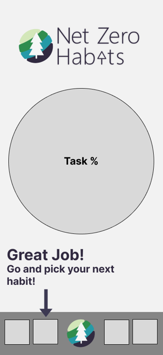
Low-fidelity Prototype
With the complete planning of the wireframes complete, I created the closest thing to the final product that I could for my low-fidelity prototype. This allowed for testing to be much more thorough than a regular usability test, and was all done withing the original timeframe.
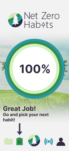
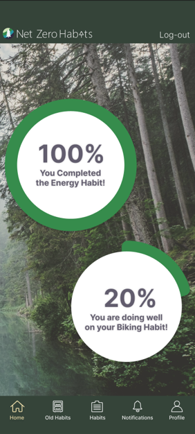
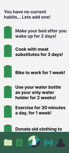
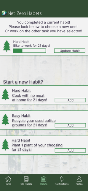
The user flow was: launching the application, checking the last completed habit, selecting the habit tracking section, choosing and confirming a new habit, verifying that the habit tracking has started, and exploring other app features while offline.
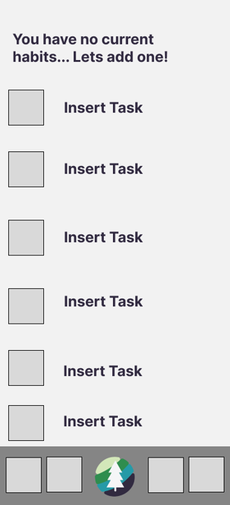
Updates
The left is the old app, the right is the new!
During the usability test phase, feedback highlighted a lack of coherence within my app's design. To address this issue, I revisited an earlier concept from my wireframes—a concept that had shown promise in usability. Despite its initial exclusion, this older idea resonated well due to its superior readability and intuitive navigation.
By integrating this proven concept into the modern app framework, I aimed to enhance overall usability and foster a more cohesive user experience. This iterative process underscored the importance of drawing from previous design iterations to refine and fortify the app's usability, ensuring that user interaction was intuitive and seamless.

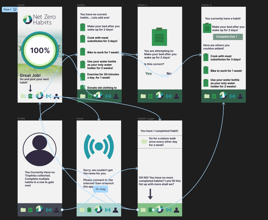
The App.
The final variant of the app is available via a link to the final figma prototype right Here!


